TTC Buddy
TTC Buddy is a UX design concept for Brainstation's UX Design Certificate program. It is a transit planner app utilizing Google Maps' navigation and live updates from TTC's database to provide and simplify important information regarding their commute.
Client
BrainStation/Personal Project
Role
UX/UI, User Research, Visual Design
Team
Individual
Timeline
8 weeks
The Problem: No official app for Toronto's transit system
The Toronto Transit Commission (TTC) is the primary transit agency in Toronto, Ontario, Canada that operates most of the city's bus and rail services. There are approximately 2.55 million daily commuters in Toronto (Source: American Public Transportation Association) and while many third-party mobile apps exist, the city does not have an official transit app. Over the years, commuters have had many growing frustrations with the transit system and the lack of transparency regarding updates, safety and scheduling.
The Solution: A reliable and supportive transit planning app
The TTC Buddy app is designed to offer a user-friendly experience with intuitive features, providing real-time updates on delays and other important information as quickly as possible. The hope is to create a transit app that can help users feel confident about their travel routes and reduce the stress of planning ahead.
User Research: Interviews and Competitive Analysis
I conducted interviews with individuals who actively use the TTC daily for work and school and as their only source of transportation. The target audience was daily commuters familiar with the TTC and/or had the same route every day. With this particular audience, we can dive into features and information that are important and helpful to their commuting experience.
In addition to interviews, a competitive analysis was conducted on the most used third-party app for transit planning: Transit.
User Interview Insights
Insight #1: Users are familiar with their work commute and rely on apps for general information and updates impacting their travel.
Insight #2: Users want to know what and when delays are happening and what to do next.
Overall, users felt comfortable with their local transportation schedule due to their routine of going to work.
The most common app used for day-to-day commutes was Google Maps. Two out of the three participants used or have used Transit before. The use of these apps depended on the user's destination. A user was more likely to use Google Maps features to help navigate to an unfamiliar destination, whereas Transit was used for live bus tracking and schedule accuracy.
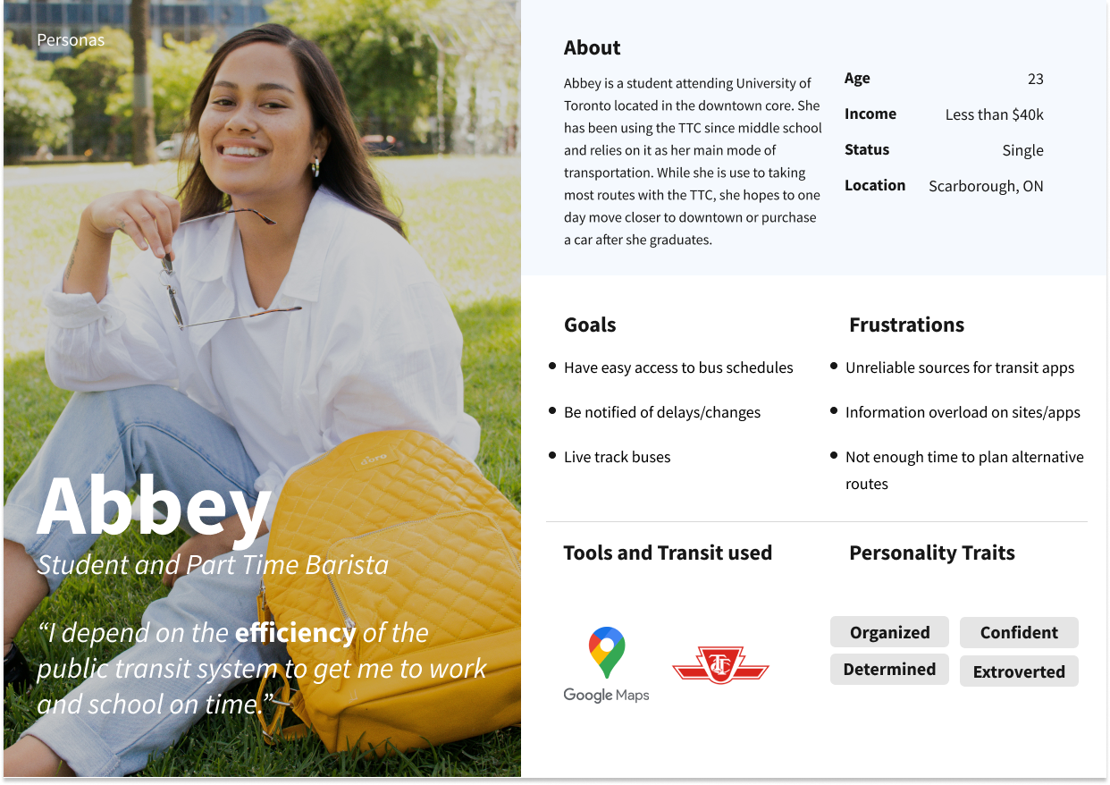
Three personas were created based on the results of the interviews and competitive analysis
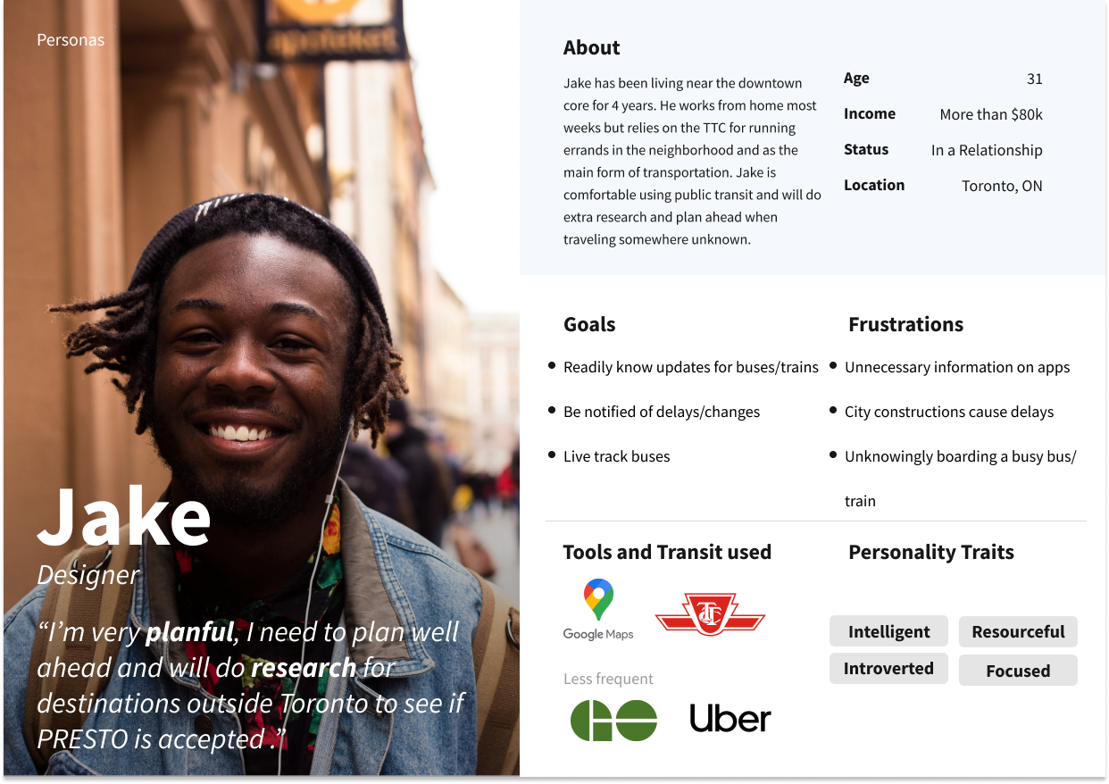
Three personas were created based on the results of the interviews and competitive analysis
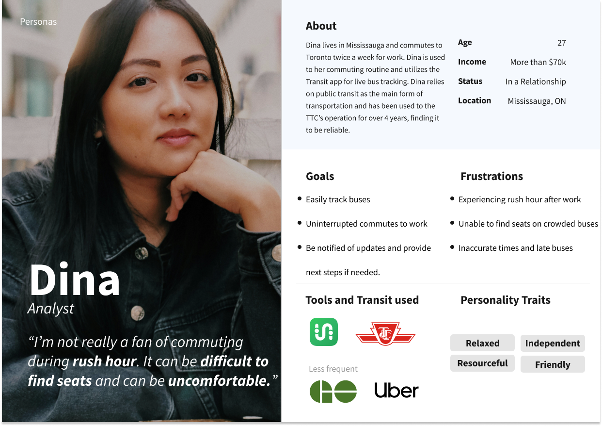
Three personas were created based on the results of the interviews and competitive analysis
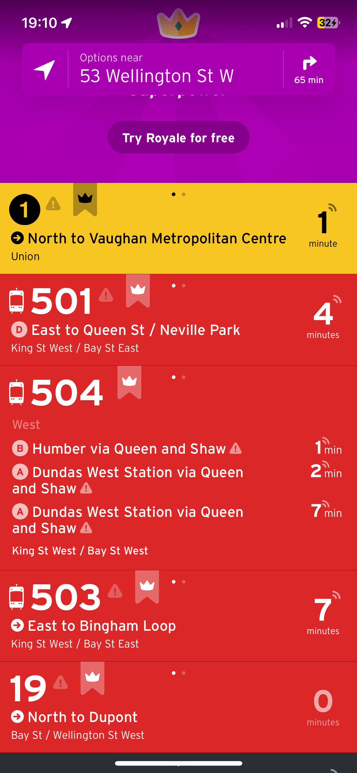
Main/Home screen based on current location
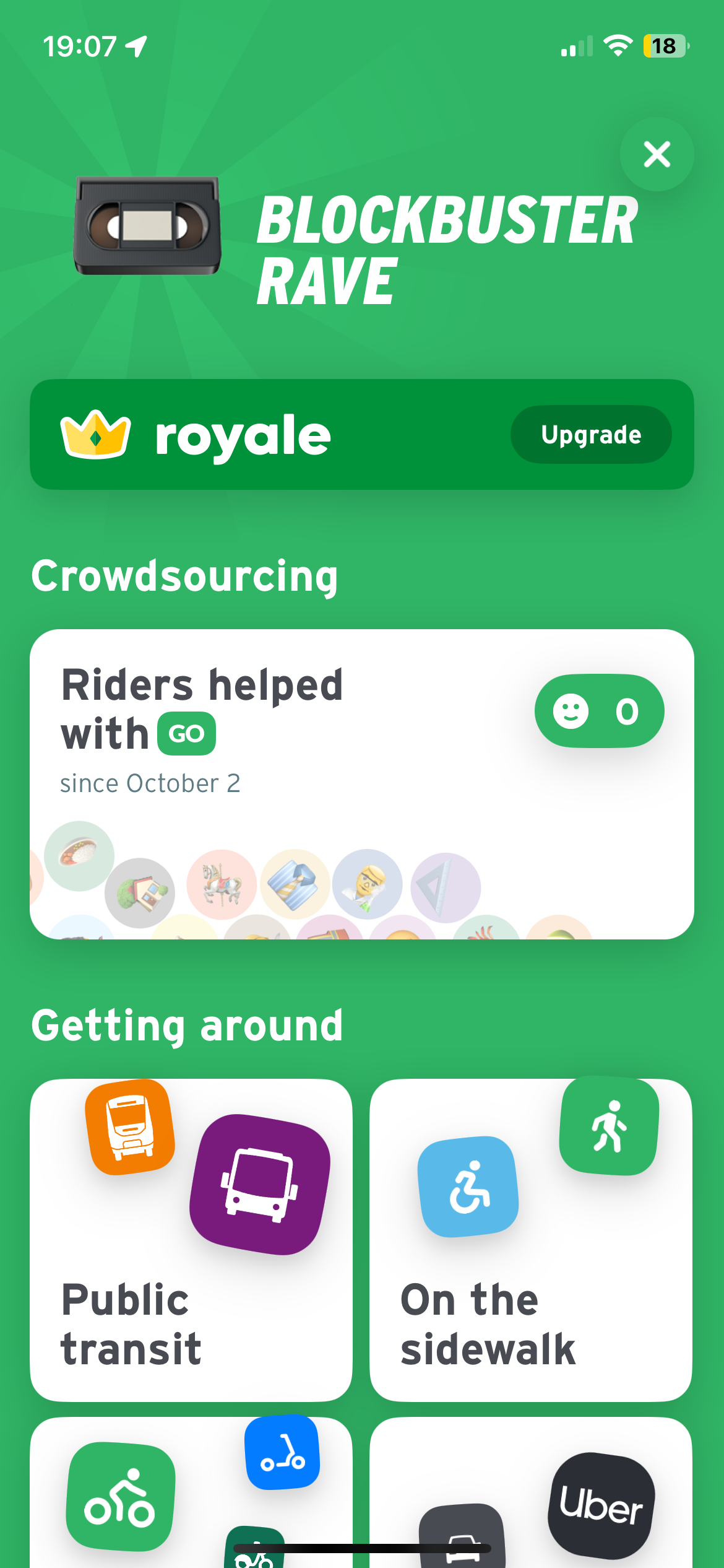
Settings/profile page
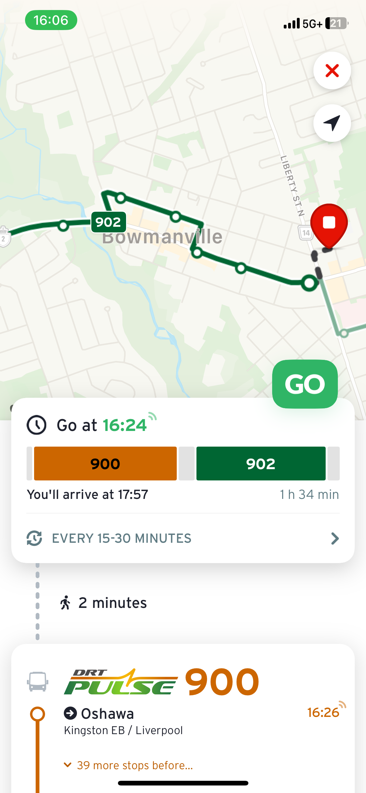
Route started screen
Competitive Analysis: Transit
Participants familiar with Transit were asked to describe their experience during the interview. In addition to my comparison, a few key insights overlapped:
1. The UI is "too busy" with information overload. This has caused confusion and lack of clarity for some tasks, including how to undo an action, profile/app settings, and information about routes.
2. There is a lack of user control/freedom. There are limited or hidden back functions to correct mistakes.
Based on the research gathered and the personas created, I concluded the design solution that would work best would closely follow Usability Heuristic #8: Aesthetics and Minimalist Design with design elements only showcasing important information crucial to the user experience. In this case, users want accurate information that will impact their journey and, if necessary, the next steps to ensure a successful commute.
User Task Flow
Due to the timeline of the project, I wanted to focus on simple and easy tasks such as signing in and looking up a route.
Sketches
I created digital sketches on Procreate to explore how the app would look and feel. The inspiration for the visuals came from existing navigational apps such as Google Maps, thus the design came easily while sketching.
Wireframes
Here are three screens depicting some low-fidelity wireframes of the main screens. I kept building off the route selection as many of the screens would be similar and utilize similar visuals.
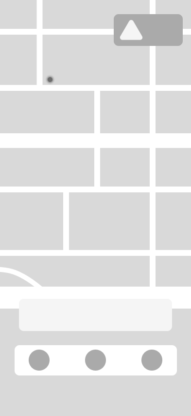
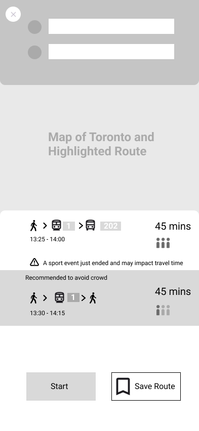
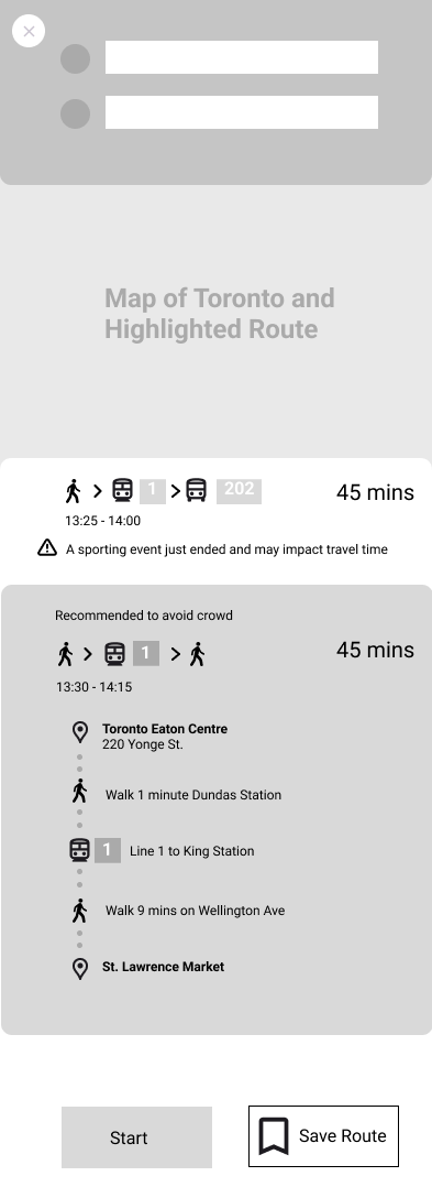
Style Guide
The goal for the visuals and branding was to create a softened version of the existing TTC colours. Instead of the iconic bright and deep red, I chose a coral red with a friendly, inviting, and fun vibe. I tried to avoid harsh colours except for the typography. After my first round of user testing, I was given feedback regarding accessibility about the lighter colours, especially white font on a lighter colour. I made the adjustments for yellow, grey and green to make sure they were met with the proper standard for WCAG.
Final Design
Check out the Figma prototype here!
Familiarity and Simplicity
Integration of Google Maps brings familiarity to users while providing information about capacity and live tracking within the same screen.
Updates
The update window when clicked provides an overlay with detailed information that is impacting city transit. Detailed and accurate information provides a sense of empathy.
Learning Outcomes
The beauty of public transit apps is that they can utilize data from several sources. If I continue this project, I'd like to develop live-tracking capacity levels utilizing user feedback. I would also like to add additional features such as the cost of all trips. Further user interviews can help determine other important features. Lastly, I'd like to explore micro-interactions/animation and expand on the visual design by further elaborating the design system and defining the branding identity.
